Information Handling is the branch of statistics concerned with collecting, organising, displaying, and summarising data so that it can be understood and used to draw conclusions. Raw data collected from surveys, experiments, or records is rarely useful on its own — it must first be classified as discrete or continuous, then arranged into a frequency distribution with clearly defined classes, class limits, and class boundaries, before it can be displayed visually as a histogram or a frequency polygon.
Once data has been organised, its most important features can be summarised using measures of central tendency — the arithmetic mean, median, and mode — each of which locates a different kind of 'typical' or 'central' value within the data set. A weighted mean extends the idea of an average to situations where some observations matter more than others. Together, these tools of information handling are used constantly in real life: businesses use them to analyse sales, governments and institutions use them to allocate budgets fairly, and analysts use them to forecast future trends from past data.
Learning Objectives
- Distinguish between discrete data and continuous data, and between ungrouped (raw) data and grouped data.
- Construct a frequency distribution from raw data, including calculating the range, class size, and class boundaries.
- Draw a histogram for grouped data with equal class widths, and for grouped data with unequal class widths using adjusted frequency.
- Draw a frequency polygon from a frequency distribution, both independently and on top of a histogram.
- Calculate the arithmetic mean of grouped and ungrouped data using both the direct method and the short-cut (assumed-mean) method.
- Calculate the median of ungrouped data (odd and even n) and of grouped data using the median formula.
- Calculate the mode of ungrouped data and of grouped data using the mode formula, and calculate a weighted mean.
- Apply measures of central tendency to real-life situations such as sales analysis, fund allocation, and forecasting.
Key Concepts
12.1 Data, Discrete Data, and Continuous Data
Data is any collection of facts, figures, or observations gathered for a particular purpose, while information is the meaningful conclusion drawn after that data has been organised, summarised, and interpreted. Before any conclusion can be drawn, raw data must first be collected, arranged, and analysed using appropriate statistical methods — this entire process is called information handling.
Data is classified into two basic types depending on how it is obtained. Discrete data consists of whole-number values obtained by counting a countable quantity, such as the number of books sold in a shop, the number of students absent from a class, or the number of goals scored in a match — such values cannot take fractional or decimal values (there is no such thing as 3.5 books sold). Continuous data, by contrast, consists of values obtained by measuring a quantity that can take any value, including decimals, within a range — such as the mass of a student in kilograms, the height of a plant in centimetres, or the time taken to run a race, all of which can be recorded to any required level of precision.
12.2 Ungrouped and Grouped Data; Constructing a Frequency Distribution
Ungrouped data (also called raw data) is data exactly as it was collected, before being organised or arranged in any way — for example, the individual test marks of 30 students listed in the order they were recorded. Grouped data is the same data reorganised into a number of class intervals (or classes), each covering a small range of values, with a count of how many data values fall into each class. Each class has a lower class limit and an upper class limit, the smallest and largest values that the class is defined to contain; a frequency distribution is a table listing every class alongside its frequency — the number of data values that fall within that class.
A frequency distribution is constructed in a fixed sequence of steps. First, find the range of the raw data: Range = Xmax – Xmin, the largest value minus the smallest value. Second, decide on a suitable number of classes (commonly 5 to 10) and find the class size by dividing the range by the number of classes, rounding the result up to a convenient whole number: Class size = Range / number of classes. Third, set out four columns — class limits, tally marks, frequency, and class boundaries — and tally every raw data value into its correct class to obtain the frequency column. Finally, the class boundaries are found by subtracting half the gap between consecutive class limits (typically 0.5) from every lower limit, and adding the same half-gap to every upper limit, which removes the gap between classes so that the classes run continuously into one another.
12.3 Histogram: Equal and Unequal Class Widths
A histogram is a graph of a frequency distribution in which adjoining rectangular bars are drawn above each class, with no gaps between the bars (since the class boundaries used on the horizontal axis already touch each other). When every class in the distribution has the same width, the histogram is drawn simply by making the height of each bar equal to that class's frequency; taller bars therefore directly represent higher frequencies, and the bars can be compared at a glance.
When the classes of a distribution have unequal widths, however, using the raw frequency as the bar height would be misleading, because a wide class would produce a tall bar purely due to its width, exaggerating its apparent importance compared with a narrow class of similar frequency. To correct for this, each bar's height is instead set to its adjusted frequency, found by dividing the class frequency by the class width: adjusted frequency = frequency / class width. Using adjusted frequency as the height ensures that the area of each bar (width x height) remains proportional to its actual frequency, which is the property a histogram is meant to preserve regardless of how the class widths vary.
12.4 Frequency Polygon
A frequency polygon is a line graph formed by plotting the frequency of each class against its midpoint (also called the class mark), calculated as midpoint = (lower class limit or boundary + upper class limit or boundary) / 2, and then joining the plotted points in order with straight line segments. Because it is plotted using midpoints rather than a series of bars, a frequency polygon can be drawn directly from a frequency distribution without first constructing a histogram.
To complete the shape so that it encloses an area comparable to the histogram, the line at each end of the polygon is extended to touch the horizontal axis at the midpoint of the imaginary next class on either side (a class with frequency zero). A frequency polygon can also be drawn on top of an existing histogram — sometimes called a 'frequency polygon on histogram' — by marking the midpoint of the top of each bar and joining these midpoints with straight lines; this variant is useful for comparing the smoothed trend of the data directly against the bars it was derived from.
12.5 Arithmetic Mean
The arithmetic mean, written X-bar (read 'x-bar'), is the most commonly used measure of central tendency: it locates the average, or typical central value, of a data set. For ungrouped data, the direct-method formula is X-bar = (Sum of x) / n, where the sum of all the individual values is divided by the total number of values, n. For grouped data, each class is represented by its midpoint x, and the direct-method formula becomes X-bar = (Sum of fx) / (Sum of f), where each midpoint is first multiplied by its class frequency f before the fx values are summed and divided by the total frequency.
When the data values (or midpoints) are large numbers, computing Sum of x or Sum of fx directly can be tedious, so a short-cut (assumed-mean) method is often used instead. An assumed mean A — usually chosen close to the middle of the data — is subtracted from every value (or midpoint) to give a deviation D = x – A, which is a much smaller, easier-to-handle number. The mean is then recovered using X-bar = A + (Sum of D) / n for ungrouped data, or X-bar = A + (Sum of fD) / (Sum of f) for grouped data; both short-cut formulas always give exactly the same answer as the corresponding direct-method formula.
12.6 Median
The median is the middle value of a data set once it has been arranged in ascending (or descending) order, so that exactly half the values lie below it and half lie above it. For ungrouped data with an odd number of values n, the median is the ((n+1)/2)th value in the ordered list. For ungrouped data with an even number of values n, there is no single middle value, so the median is taken as the average of the (n/2)th and the (n/2 + 1)th values.
For grouped data, the median is estimated using the formula Median = l + (h/f)(n/2 – c), where l is the lower class boundary of the median class (the class containing the (n/2)th value), h is the class size, f is the frequency of the median class, n is the total frequency of the whole distribution, and c is the cumulative frequency of all classes before the median class. The median class itself is located by building a cumulative frequency column and finding the first class whose cumulative frequency reaches or exceeds n/2.
12.7 Mode, Weighted Mean, and Real-Life Applications
The mode is the value (or class) that occurs most frequently in a data set. Unlike the mean and median, a data set can have no mode at all (if every value occurs equally often), exactly one mode (unimodal), or more than one mode (bimodal or multimodal) if two or more values are tied for the highest frequency. For grouped data, the mode is estimated using Mode = l + [(fm – f1) / ((fm – f1) + (fm – f2))] x h, where l is the lower boundary of the modal class (the class with the highest frequency fm), f1 is the frequency of the class immediately before the modal class, f2 is the frequency of the class immediately after it, and h is the class size.
The weighted mean, X-bar_w = (Sum of WX) / (Sum of W), is used whenever different observations carry different levels of importance, represented by a weight W attached to each value X — such as subjects with different credit hours contributing differently to a grade-point average, or items purchased in different quantities contributing differently to an average price. These measures of central tendency have wide real-life use: businesses compute the mean, median, and mode of sales figures to identify typical performance and best-selling items (the modal class), governments and schools use the mean to allocate funds fairly across departments or sectors based on past spending, and analysts use measures of central tendency together with trends in the data for forecasting and budgeting future needs.
Important Definitions
Data
A collection of facts, figures, or observations gathered for a particular purpose, before it has been organised or interpreted.
Discrete Data
Data consisting of whole-number values obtained by counting a countable quantity, such as the number of items sold; it cannot take fractional or decimal values.
Continuous Data
Data consisting of values obtained by measuring a quantity, which can take any value, including decimals, within a given range, such as mass or height.
Class Limits
The stated lower and upper values that define which raw data values belong to a particular class of a grouped frequency distribution.
Class Boundaries
The true continuous limits of a class, found by adjusting the class limits by half the gap between consecutive classes, so that adjoining classes touch with no gap.
Frequency Distribution
A table that lists every class of a grouped data set alongside its frequency, the number of raw data values that fall within that class.
Histogram
A graph of a frequency distribution made up of adjoining rectangular bars drawn above the class boundaries, with bar height (or adjusted height) representing frequency.
Frequency Polygon
A line graph formed by plotting each class's frequency against its midpoint and joining the points with straight lines, extended to touch the horizontal axis at both ends.
Class Mark (Midpoint)
The middle value of a class, calculated as (lower limit or boundary + upper limit or boundary) / 2; used to represent the whole class in calculations.
Measure of Central Tendency
A single value, such as the mean, median, or mode, that represents or locates the centre of a data set.
Key Facts and Relations
| Topic | Key Fact / Relation |
|---|---|
| Range | Range = Xmax – Xmin, the largest value minus the smallest value in the raw data. |
| Class Size | Class size = Range / number of classes, rounded up to a convenient whole number. |
| Class Boundary | Class boundary = class limit ± half the gap between consecutive class limits (typically ± 0.5). |
| Arithmetic Mean — direct method | X-bar = (Sum of x)/n (ungrouped); X-bar = (Sum of fx)/(Sum of f) (grouped, using class midpoints). |
| Arithmetic Mean — short-cut method | X-bar = A + (Sum of D)/n (ungrouped); X-bar = A + (Sum of fD)/(Sum of f) (grouped), where D = x – A and A is the assumed mean. |
| Median — ungrouped data | Odd n: the ((n+1)/2)th value; Even n: average of the (n/2)th and (n/2 + 1)th values, once data is arranged in order. |
| Median — grouped data | Median = l + (h/f)(n/2 – c), where l = lower boundary of median class, h = class size, f = frequency of median class, n = total frequency, c = cumulative frequency before the median class. |
| Mode — grouped data | Mode = l + [(fm – f1)/((fm – f1) + (fm – f2))] x h, where l = lower boundary of modal class, fm/f1/f2 = frequency of the modal, preceding, and following classes, h = class size. |
| Weighted Mean | X-bar_w = (Sum of WX)/(Sum of W), where W is the weight (importance) attached to each value X. |
Diagrams
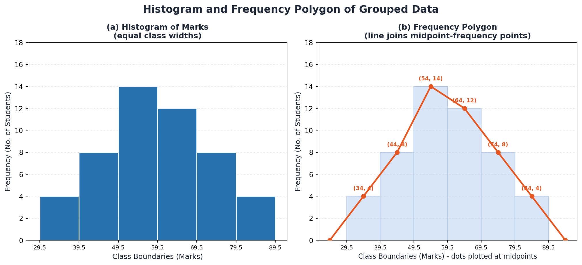
Histogram and Frequency Polygon of Grouped Data: A two-panel figure: the left panel shows a histogram of test marks for 50 students across six equal-width classes; the right panel shows the frequency polygon for the same data, formed by joining midpoint-frequency points and extended to touch the x-axis at both ends.
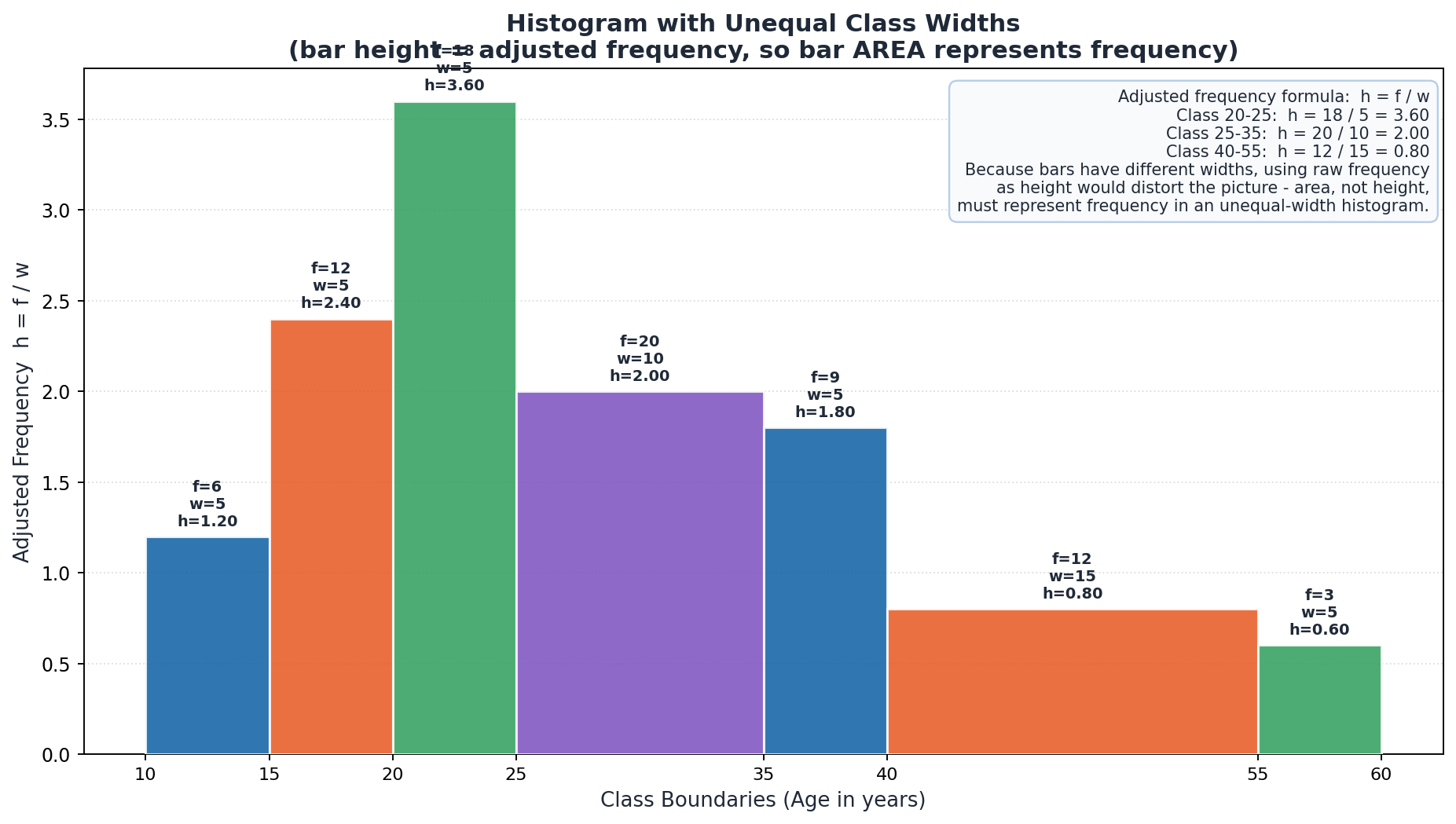
Histogram with Unequal Class Widths: A histogram of the ages of 80 club members grouped into seven classes of different widths, with each bar's height set to the adjusted frequency (frequency / class width) and annotated with the f, w, and h values for each class, so that bar area — not height — represents true frequency.
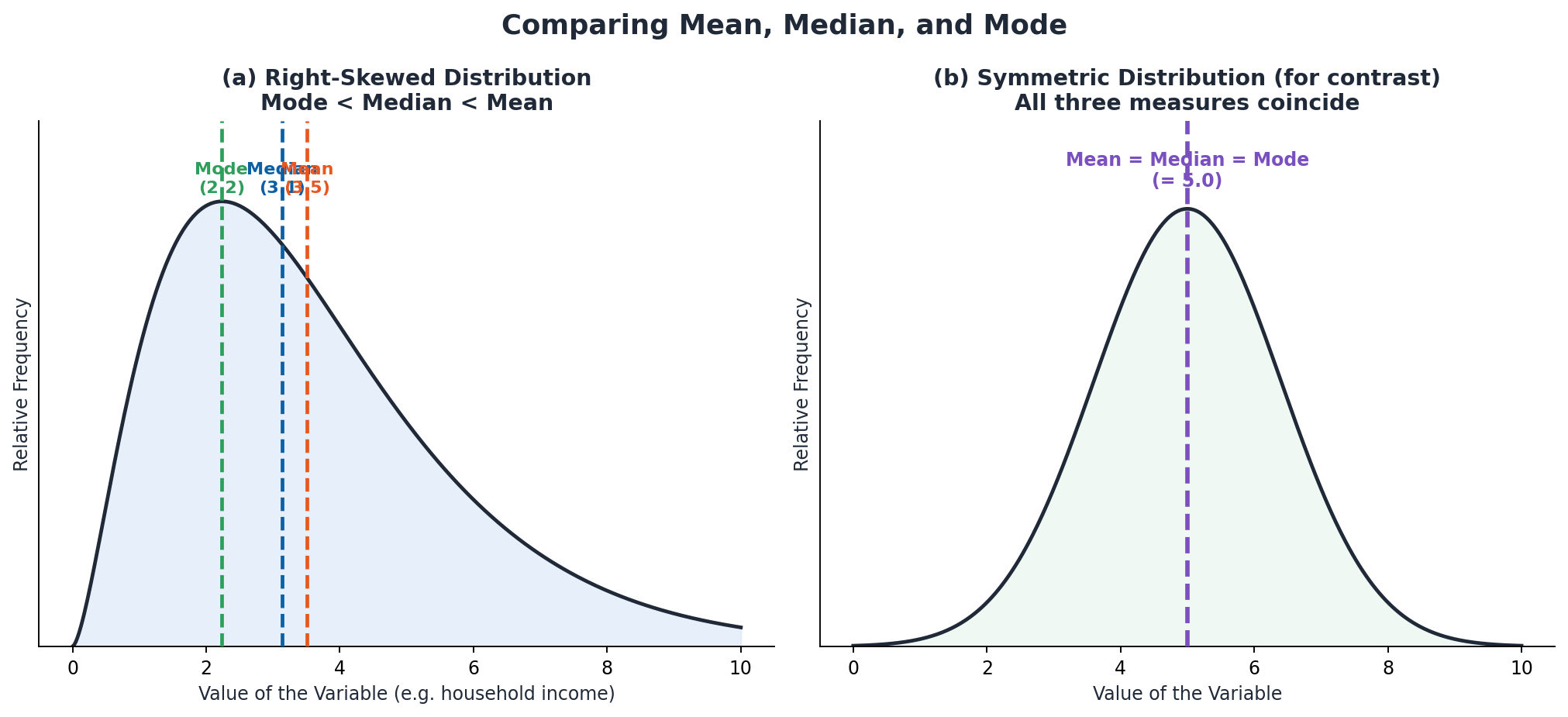
Comparing Mean, Median, and Mode: A two-panel figure: the left panel shows a right-skewed distribution curve with the mode, median, and mean marked as vertical dashed lines in their typical order (Mode < Median < Mean); the right panel shows a symmetric distribution in which all three measures coincide, for contrast.
Solved Examples
Example 1: Constructing a Frequency Distribution from Raw Data
Problem: The number of customers served by a small shop on each of 30 days ranges from a minimum of 12 to a maximum of 58 customers. Construct a frequency distribution with 7 classes.
- Find the range: Range = Xmax – Xmin = 58 – 12 = 46.
- Find the class size: Class size = Range / number of classes = 46 / 7 ≈ 6.57, rounded up to 7 so the classes are wide enough to cover the full range.
- Starting from the minimum value 12, list the seven classes of width 7: 12-18, 19-25, 26-32, 33-39, 40-46, 47-53, 54-60.
- Tally the 30 data values into these seven classes to obtain frequencies of 3, 5, 7, 6, 5, 3, and 1, which sum to 3+5+7+6+5+3+1 = 30, confirming every value was tallied.
- Find the class boundaries by subtracting 0.5 from each lower limit and adding 0.5 to each upper limit (half the gap of 1 unit between consecutive class limits): 11.5-18.5, 18.5-25.5, 25.5-32.5, 32.5-39.5, 39.5-46.5, 46.5-53.5, 53.5-60.5.
Example 2: Drawing a Histogram with Unequal Class Widths
Problem: The ages of 80 members of a fitness club are grouped into unequal-width classes as follows: 10-15 (f = 6), 15-20 (f = 12), 20-25 (f = 18), 25-35 (f = 20), 35-40 (f = 9), 40-55 (f = 12), 55-60 (f = 3). Draw a histogram for this data.
- Compute the width of each class from its boundaries: 10-15, 15-20, 20-25, 35-40, and 55-60 are each 5 years wide; 25-35 is 10 years wide; 40-55 is 15 years wide.
- Since the class widths are not equal, using raw frequency as bar height would exaggerate the wider classes, so compute the adjusted frequency h = f / w for each class instead.
- Class 10-15: h = 6/5 = 1.2. Class 15-20: h = 12/5 = 2.4. Class 20-25: h = 18/5 = 3.6.
- Class 25-35: h = 20/10 = 2.0. Class 35-40: h = 9/5 = 1.8.
- Class 40-55: h = 12/15 = 0.8. Class 55-60: h = 3/5 = 0.6. Draw bars on the class-boundary x-axis with these adjusted-frequency heights, so each bar's area (width × height) equals its true frequency.
Example 3: Drawing a Frequency Polygon
Problem: Marks obtained by 50 students in a mathematics test are grouped as follows (class boundaries and frequency): 29.5-39.5 (f=4), 39.5-49.5 (f=8), 49.5-59.5 (f=14), 59.5-69.5 (f=12), 69.5-79.5 (f=8), 79.5-89.5 (f=4). Draw the frequency polygon for this distribution.
- Find the midpoint (class mark) of each class using midpoint = (lower + upper)/2: 34.5, 44.5, 54.5, 64.5, 74.5, 84.5.
- Plot each pair (midpoint, frequency): (34.5, 4), (44.5, 8), (54.5, 14), (64.5, 12), (74.5, 8), (84.5, 4).
- Join the plotted points in order with straight line segments to form the body of the polygon.
- Extend the line at each end to touch the x-axis at the midpoint of the next (empty) class on either side: 24.5 before the first class and 94.5 after the last class, each with frequency 0.
- Check that the frequencies sum to the total number of students: 4+8+14+12+8+4 = 50, matching the given 50 students.
Example 4: Arithmetic Mean by the Direct Method (Grouped Data)
Problem: The weights (in kg) of 40 parcels handled by a courier office in one day are grouped as follows: 1-5 kg (f=4), 6-10 kg (f=10), 11-15 kg (f=14), 16-20 kg (f=8), 21-25 kg (f=4). Find the arithmetic mean weight using the direct method.
- Find the midpoint x of each class: 3, 8, 13, 18, 23.
- Multiply each midpoint by its frequency (fx): 4×3=12, 10×8=80, 14×13=182, 8×18=144, 4×23=92.
- Sum the frequencies: Sum of f = 4+10+14+8+4 = 40.
- Sum the fx values: Sum of fx = 12+80+182+144+92 = 510.
- Apply the direct-method formula: X-bar = (Sum of fx) / (Sum of f) = 510 / 40 = 12.75 kg.
Example 5: Arithmetic Mean by the Short-Cut (Assumed-Mean) Method
Problem: Using the same parcel-weight data as the previous example (classes with midpoints 3, 8, 13, 18, 23 and frequencies 4, 10, 14, 8, 4), find the arithmetic mean using the short-cut formula, taking the assumed mean A = 13.
- Take the assumed mean A = 13 (the midpoint of the middle class).
- Find the deviation D = x – A for each class: 3-13=-10, 8-13=-5, 13-13=0, 18-13=5, 23-13=10.
- Multiply each deviation by its frequency (fD): 4×(-10)=-40, 10×(-5)=-50, 14×0=0, 8×5=40, 4×10=40.
- Sum the fD values: Sum of fD = -40 + (-50) + 0 + 40 + 40 = -10.
- Apply the short-cut formula: X-bar = A + (Sum of fD)/(Sum of f) = 13 + (-10/40) = 13 – 0.25 = 12.75 kg, exactly matching the direct-method result.
Example 6: Median for Grouped Data
Problem: Using the test-marks distribution (classes 29.5-39.5 to 79.5-89.5 with frequencies 4, 8, 14, 12, 8, 4, total n=50), find the median mark.
- Find n/2 = 50/2 = 25.
- Build the cumulative frequency column: 4, 12, 26, 38, 46, 50.
- Identify the median class as the first class whose cumulative frequency is ≥ 25: this is 49.5-59.5, with cumulative frequency 26.
- Note the values needed: l = 49.5 (lower boundary), h = 10 (class size), f = 14 (frequency of median class), c = 12 (cumulative frequency before the median class).
- Apply the median formula: Median = l + (h/f)(n/2 – c) = 49.5 + (10/14)(25-12) = 49.5 + (10/14)(13) ≈ 49.5 + 9.29 = 58.79 marks.
Example 7: Mode for Grouped Data
Problem: Using the same test-marks distribution, the modal class has the highest frequency of 14, occurring in class 49.5-59.5, with the classes immediately before and after having frequencies 8 and 12 respectively. Find the mode.
- Identify the modal class as the class with the highest frequency: 49.5-59.5, with fm = 14.
- Note the frequency of the class before the modal class: f1 = 8 (class 39.5-49.5).
- Note the frequency of the class after the modal class: f2 = 12 (class 59.5-69.5).
- Note l = 49.5 (lower boundary of modal class) and h = 10 (class size).
- Apply the mode formula: Mode = l + [(fm-f1)/((fm-f1)+(fm-f2))]×h = 49.5 + [(14-8)/((14-8)+(14-12))]×10 = 49.5 + (6/8)×10 = 49.5 + 7.5 = 57 marks.
Example 8: Weighted Mean
Problem: A student's exam marks and the credit-hour weight of each subject are: Mathematics 85 (weight 4), Physics 78 (weight 3), Chemistry 82 (weight 3), English 75 (weight 2), Computer Science 90 (weight 2). Find the weighted mean mark.
- Multiply each mark by its corresponding weight (WX): 85×4=340, 78×3=234, 82×3=246, 75×2=150, 90×2=180.
- Sum the WX values: Sum of WX = 340+234+246+150+180 = 1150.
- Sum the weights: Sum of W = 4+3+3+2+2 = 14.
- Apply the weighted mean formula: X-bar_w = (Sum of WX) / (Sum of W) = 1150 / 14 ≈ 82.14.
- Compare with the simple (unweighted) mean of the marks, (85+78+82+75+90)/5 = 410/5 = 82.0, showing the weighted mean shifts slightly toward the higher-weight subject (Mathematics).
Short Questions & Answers
What is the difference between discrete data and continuous data? Give one example of each.
Discrete data consists of whole-number values obtained by counting, such as the number of cars sold in a showroom in a month, and cannot take fractional values. Continuous data consists of values obtained by measuring, such as the height of students in centimetres, and can take any value including decimals within a range.
What is the difference between ungrouped (raw) data and grouped data?
Ungrouped (raw) data is data exactly as collected, listed individually without any organisation. Grouped data is the same data reorganised into a number of class intervals, with the number of values falling into each class recorded as its frequency.
How are class boundaries calculated from class limits?
Class boundaries are found by subtracting half the gap between consecutive class limits (usually 0.5) from every lower class limit, and adding the same half-gap to every upper class limit. This removes the gap between classes so that consecutive classes touch each other continuously, which is needed for drawing an accurate histogram.
Why is bar height adjusted (using f/w) in a histogram with unequal class widths?
If classes have unequal widths, using raw frequency as bar height would make wider classes look taller and more important than they really are. Dividing frequency by class width (f/w) gives an adjusted frequency, so that the area of each bar (width x height) stays proportional to its true frequency.
How is a frequency polygon constructed from a frequency distribution?
Plot the midpoint (class mark) of each class against its frequency, then join these points in order with straight line segments. The line is extended at both ends to touch the horizontal axis at the midpoints of the imaginary empty classes just before the first and just after the last class.
What is the median class in grouped data, and how is it identified?
The median class is the class that contains the (n/2)th value of the data set. It is identified by building a cumulative frequency column and finding the first class whose cumulative frequency is equal to or greater than n/2, where n is the total frequency.
What is a weighted mean and when should it be used instead of a simple arithmetic mean?
A weighted mean, X-bar_w = (Sum of WX)/(Sum of W), gives each value X an importance weight W before averaging. It should be used instead of a simple mean whenever observations are not all equally important, such as subjects with different credit hours or items bought in different quantities.
Can a set of data have more than one mode? Explain.
Yes. A data set is unimodal if exactly one value has the highest frequency, but it can be bimodal or multimodal if two or more values are tied for the highest frequency, or it can have no mode at all if every value occurs the same number of times.
Long Questions & Answers
Explain how a frequency distribution is constructed from raw data, including histograms with equal and unequal class widths.
What are the steps to construct a frequency distribution from raw (ungrouped) data?
Constructing a frequency distribution begins by finding the range of the raw data, Range = Xmax – Xmin, the difference between the largest and smallest values. A suitable number of classes (commonly 5 to 10) is chosen, and the class size is found by dividing the range by the number of classes and rounding up: Class size = Range / number of classes. A table is then set out with four columns — class limits, tally marks, frequency, and class boundaries — and every raw data value is tallied into its correct class to build up the frequency column. Finally, class boundaries are calculated by adjusting the class limits by half the gap between consecutive classes.
What are class limits and class boundaries, and how do they differ?
Class limits are the stated lower and upper values that define which raw data values belong to a class, for example the class '11-20' has a lower limit of 11 and an upper limit of 20. Because consecutive class limits usually leave a small gap (such as the gap between 20 and the next class's lower limit of 21), class limits alone cannot be used directly to draw an accurate histogram. Class boundaries close this gap: half of the gap between consecutive limits (typically 0.5) is subtracted from each lower limit and added to each upper limit, giving continuous boundaries such as 10.5-20.5, which touch the next class's boundary exactly.
How is a histogram drawn when all classes have equal width?
When every class in a frequency distribution has the same width, a histogram is drawn by marking the class boundaries along the horizontal axis and the frequency scale along the vertical axis, then drawing a rectangular bar above each class whose height is simply equal to that class's frequency. Because all the bars share the same width, taller bars directly and fairly represent higher frequencies, and no adjustment to the height is needed. The bars are drawn touching each other, with no gaps between them, since the class boundaries of adjoining classes are identical.
How is a histogram drawn when classes have unequal width, and why is adjustment needed?
When classes have unequal widths, using the raw frequency as bar height would make wider classes appear taller and more significant purely because of their width, distorting the true picture of the data. To avoid this, each bar's height is set to its adjusted frequency, calculated as adjusted frequency = frequency / class width. This ensures that the area of each bar, not just its height, is what represents the class's actual frequency, keeping the histogram's proportions accurate and comparable even though the bars have different widths.
Explain the three measures of central tendency (mean, median, mode) and weighted mean, including their formulas for grouped data.
How is the arithmetic mean of grouped data calculated by the direct method and the short-cut (assumed-mean) method?
By the direct method, each class is represented by its midpoint x, which is multiplied by the class frequency f to give fx; these fx values are summed and divided by the total frequency, giving X-bar = (Sum of fx) / (Sum of f). By the short-cut (assumed-mean) method, a convenient assumed mean A near the centre of the data is chosen, and the deviation D = x – A is found for each class; the mean is then X-bar = A + (Sum of fD) / (Sum of f). Both methods always give the identical final answer, but the short-cut method involves smaller, easier numbers when the original values are large.
How is the median of grouped data calculated, and what does each symbol in the formula represent?
The median of grouped data is calculated using Median = l + (h/f)(n/2 – c). Here, l is the lower class boundary of the median class, the class containing the (n/2)th value; h is the class size (width) of the median class; f is the frequency of the median class; n is the total frequency of the whole distribution; and c is the cumulative frequency of all the classes that come before the median class. The median class itself is located first, by building a cumulative frequency column and finding the first class whose cumulative frequency reaches or exceeds n/2.
How is the mode of grouped data calculated, and what does each symbol in the formula represent?
The mode of grouped data is calculated using Mode = l + [(fm – f1)/((fm – f1) + (fm – f2))] x h. Here, l is the lower class boundary of the modal class, the class with the highest frequency; fm is the frequency of the modal class itself; f1 is the frequency of the class immediately before the modal class; f2 is the frequency of the class immediately after it; and h is the class size. The formula works by weighting the modal class boundary toward whichever neighbouring class is more crowded, giving a more accurate estimate than simply reporting the midpoint of the modal class.
What is a weighted mean, and how does it differ from a simple arithmetic mean in real-life applications?
A weighted mean, X-bar_w = (Sum of WX) / (Sum of W), multiplies each value X by an importance weight W before averaging, then divides by the sum of the weights rather than by a plain count of values. This differs from a simple arithmetic mean, which treats every value as equally important. In real life, a student's grade-point average uses the credit hours of each subject as weights so that a heavier subject contributes more to the final average, and a shopkeeper computing an average price per item across different products uses the quantity sold of each product as its weight.
Multiple Choice Questions (MCQs)
The number of books sold by a shop each day is an example of: (A) Continuous data (B) Discrete data (C) Grouped data (D) Weighted data
Correct answer: (B) Discrete data. The number of books sold is a whole-number value obtained by counting, so it is discrete data; it cannot take fractional values.
The number of times a value occurs in a data set is called its: (A) Class boundary (B) Class limit (C) Frequency (D) Range
Correct answer: (C) Frequency. Frequency is defined as the number of times a value, or the number of data values within a class, occurs in a data set.
The midpoint of a class is also known as its: (A) Class boundary (B) Class limit (C) Class mark (D) Class range
Correct answer: (C) Class mark. The midpoint of a class, calculated as (lower + upper)/2, is also called the class mark, and represents the whole class in calculations.
Which of the following statements about a frequency polygon is true? (A) It can only be drawn on top of an already-drawn histogram (B) It is formed by joining the midpoint-frequency points of a frequency distribution with straight lines, and can be drawn with or without a histogram (C) It uses class limits instead of midpoints (D) It is only used for continuous data
Correct answer: (B) It is formed by joining the midpoint-frequency points of a frequency distribution with straight lines, and can be drawn with or without a histogram. A frequency polygon is plotted directly from midpoints and frequencies, so it can be drawn on its own or on top of a histogram.
The range of a data set is calculated as: (A) Xmax + Xmin (B) Xmax – Xmin (C) (Xmax + Xmin) / 2 (D) Xmax × Xmin
Correct answer: (B) Xmax – Xmin. The range is the difference between the largest value (Xmax) and the smallest value (Xmin) in the data set.
A measure of central tendency describes: (A) The spread of the data (B) A value at or near the centre of the data (C) The largest value in the data (D) The number of classes in the data
Correct answer: (B) A value at or near the centre of the data. Measures of central tendency such as the mean, median, and mode locate a typical or central value within a data set.
If the mean of the data set 4, 6, x, 10, 12 is 8, what is the value of x? (A) 6 (B) 7 (C) 8 (D) 9
Correct answer: (C) 8. Sum of values = 5 × 8 = 40, so 4+6+x+10+12 = 40, giving 32+x = 40, so x = 8.
The mode of the data set 3, 5, 5, 7, 8, 5, 9 is: (A) 3 (B) 5 (C) 7 (D) 9
Correct answer: (B) 5. The value 5 occurs three times, more often than any other value, so the mode is 5.
A data set can have: (A) Only one mode (B) No mode, one mode, or more than one mode (C) Always exactly two modes (D) No mode under any circumstances
Correct answer: (B) No mode, one mode, or more than one mode. Depending on how frequencies are distributed, a data set may have zero, one, or several modes (unimodal, bimodal, or multimodal).
The median of the data set 12, 7, 15, 9, 21 is: (A) 9 (B) 12 (C) 15 (D) 21
Correct answer: (B) 12. Arranged in order the data is 7, 9, 12, 15, 21; with n=5 (odd), the median is the middle (3rd) value, which is 12.
Quick Revision Summary
- Discrete data is obtained by counting and takes whole-number values; continuous data is obtained by measuring and can take any value, including decimals.
- Ungrouped (raw) data is listed individually; grouped data is organised into class intervals with a recorded frequency for each class.
- Range = Xmax – Xmin; Class size = Range / number of classes, rounded up to a convenient whole number.
- Class boundaries are found by adjusting class limits by half the gap between consecutive classes (typically 0.5), removing gaps so classes touch continuously.
- In a histogram with equal class widths, bar height = frequency; with unequal class widths, bar height = adjusted frequency = frequency / class width, so bar area represents frequency.
- A frequency polygon joins (midpoint, frequency) points with straight lines and is extended to touch the x-axis at the midpoints of the empty classes on either end.
- Arithmetic mean: X-bar = (Sum of fx)/(Sum of f) by the direct method, or X-bar = A + (Sum of fD)/(Sum of f) by the short-cut method, where D = x – A.
- Median (grouped) = l + (h/f)(n/2 – c); Mode (grouped) = l + [(fm-f1)/((fm-f1)+(fm-f2))] x h.
- A data set can have zero, one, or more than one mode; the weighted mean X-bar_w = (Sum of WX)/(Sum of W) is used when observations carry different importance.
- Measures of central tendency are widely used in real life for sales analysis, fund allocation across sectors, and forecasting and budgeting.
Exam Tips
- Always double-check that your tallied frequencies add up to the total number of raw data values before drawing any graph.
- Remember class boundaries, not class limits, are used on the horizontal axis of a histogram, so classes touch with no gaps.
- In an unequal-width histogram, never use raw frequency as bar height — always compute adjusted frequency = frequency / class width first.
- When finding the median or mode of grouped data, build the cumulative frequency column carefully — a single tallying mistake will shift the whole answer.
- Verify a short-cut (assumed-mean) calculation by checking that it matches the direct-method mean; both must give exactly the same result.
- In weighted mean problems, always multiply each value by its own weight before summing — do not average the weights and values separately.