Most scientific experiments and surveys result in the collection of data in the form of batches of numbers, usually called a sample. To extract useful information from this raw sample, it must first be organized and summarized. This chapter covers the two broad approaches to doing that: tabular methods (classification, tabulation, frequency distributions, and cumulative frequency distributions) and graphical methods (bar diagrams, pie diagrams, histograms, frequency polygons, and scatter plots).
A frequency distribution condenses raw data into a compact table by grouping similar values into classes and counting how many observations fall in each class. Building one well requires deciding on the number of classes, the class width, and the class boundaries, and the same idea extends naturally to cumulative frequencies (running totals) and, for two variables measured together, bivariate frequency distributions. Graphs then turn these tables into pictures that are often easier to interpret than the numbers alone, and this chapter covers the standard toolkit: simple, multiple, and sub-divided bar diagrams; pie diagrams; histograms for equal and unequal class widths; frequency polygons and cumulative frequency polygons (ogives); and scatter plots for paired data.
Learning Objectives
- Explain classification and tabulation, and identify the parts of a well-constructed table
- Construct a frequency distribution for continuous, discrete, and categorical data
- Calculate the number of classes, class width, and class boundaries for grouped data
- Compute relative frequency, cumulative frequency, and cumulative relative frequency
- Distinguish simple, multiple, and sub-divided bar diagrams, and construct each
- Construct a pie diagram using the correct sector-angle formula
- Construct a histogram for both equal and unequal class intervals
- Construct a frequency polygon and a cumulative frequency polygon (ogive)
- Construct and interpret a scatter plot for bivariate data
- Construct a bivariate frequency distribution for paired measurements
Key Concepts
2.2 Classification
Classification is the process of arranging observations into different classes or categories according to some common characteristic. Data may be classified by one or more characteristics at a time: when data is classified according to one characteristic it is called one-way classification, by two characteristics at a time it is two-way classification, and by three characteristics it is three-way classification.
2.3 Tabulation
Tabulation is the process of making tables, or arranging data into rows and columns. Tabulation may be simple, double, triple, or complex depending on the number of characteristics involved. A well-constructed table has several standard parts: the title (a brief, self-explanatory heading at the top describing the table's contents); column captions, collectively called the box-head (brief, clear headings for each column, arranged in order of importance); row captions, collectively called the stub (brief, clear headings for each row); the body of the table (the actual entries in each cell, which may be arranged qualitatively, quantitatively, chronologically, geographically, or alphabetically); source notes (given at the end of the table, indicating the compiling agency, publication, date, and page); and prefatory notes and footnotes (used to explain the table's contents, with footnotes usually indicated by asterisks).
Spacing and ruling are used to enhance a table's effectiveness and to separate items within it: thick, double, or single lines separate row and column captions, and dots or dashes (never zeroes) are used to indicate no entry in a cell.
2.4 Frequency Distribution
A frequency distribution is a compact tabular form of data that displays categories of observations according to their magnitude and frequency, grouping similar or identical values together. These categories are also called groups, class intervals, or classes, and the number of values falling in a given category is its frequency, denoted f. The relative frequency (r.f) of a category is its frequency divided by the total frequency; the sum of all relative frequencies should equal 1 (except for rounding), and relative frequencies are especially useful for comparing distributions built from samples of different sizes.
Building a frequency distribution for continuous data follows five steps. First, calculate the range: Range = maximum value – minimum value. Second, decide the number of classes c, using c = 1 + 3.3 log(n) or approximately c = square root of n, where n is the total number of observations — too few wide classes loses variation in the data, while too many narrow classes hardly groups the values at all. Third, decide the class width h = Range / c (approximately), rounding to a convenient number. Class limits are the stated end points of each class interval; because it's best if no observation falls exactly on a boundary, class limits are converted to class boundaries by extending them one more decimal place, so that the upper boundary of one class equals the lower boundary of the next, keeping classes mutually exclusive. Fourth, decide the starting point of the first class, usually just below the minimum value so that the class midpoint (average of its lower and upper limits) is well placed. Fifth, tally each observation into its class to obtain the frequency of each class.
For discrete data, since each observation is already a whole number, the possible values are simply listed and tallied directly, without needing to compute a range or class width. For categorical data, the categories themselves are listed and tallied. An open-end class is one where either the lower limit of the first class or the upper limit of the last class is not a fixed number (for example, 'Below 5' or '75 and above') — these arise naturally in some practical situations, such as age distributions.
2.5 Cumulative Frequency Distribution
A cumulative frequency distribution displays class intervals alongside their cumulative frequencies. The cumulative frequency (c.f) of a class is obtained by adding the frequencies of all preceding classes, including that class itself, and it indicates the total number of values less than or equal to the upper limit of that class. The cumulative relative frequency (c.r.f) is the cumulative frequency divided by the total frequency (equivalently, the running sum of relative frequencies); multiplying c.r.f by 100 gives the percentage cumulative frequency. When comparing two or more distributions of different sample sizes, relative or percentage cumulative frequencies should be used instead of raw cumulative frequencies, since raw counts are distorted by differing sample sizes. The same logic applies directly to discrete data.
2.6 Graphic Representation of Data
A single well-made graph can convey more than pages of prose: graphs help check assumptions about the data, provide a subjective check on formal calculations, suggest which statistical analysis is appropriate, communicate results clearly to readers, and help spot variability and outliers (values highly inconsistent with the rest of the data). Good graphing practice includes clearly labelling both axes with variable names and units, keeping the scale uniform along each axis, keeping the diagram simple, choosing a clear and concise title, using identical scales when comparing graphs, and — for scatter plots — never joining the dots, since this can create the illusion of a pattern in random scatter.
2.6.1-2.6.3 Bar Diagrams
A simple bar diagram represents a discrete or categorical data set by drawing a bar for each category or value, with the bar's height equal to its frequency, and the values or categories placed along the x-axis. The gaps between bars emphasize the gaps between the discrete values the variable can take. A multiple bar diagram extends this to compare two or more related sets of data at once, drawing a group of bars (one per set) for each category, side by side. A sub-divided (component) bar diagram is used when a simple bar represents a total that can be broken into segments — for example, a bar for total population can be sub-divided into male and female portions within the same bar.
2.6.4 Pie Diagram
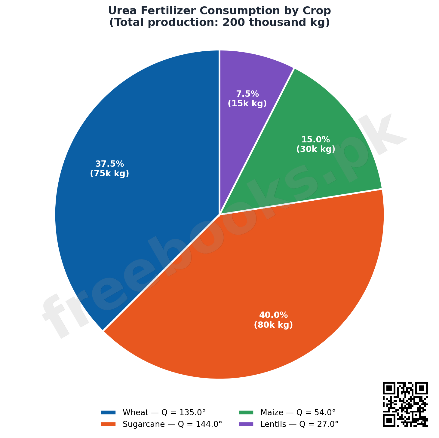
A pie diagram (or pie chart) divides a circular region into sectors representing the components of a whole. Each sector's angle Q is found using Q = (Component Part / Total) x 360 degrees, since a full circle is 360 degrees. Each sector is shaded differently so the parts are visually distinguishable. Pie diagrams are useful for displaying how a whole splits into component parts, and for comparing such divisions across different times or groups.
2.6.5 Histogram
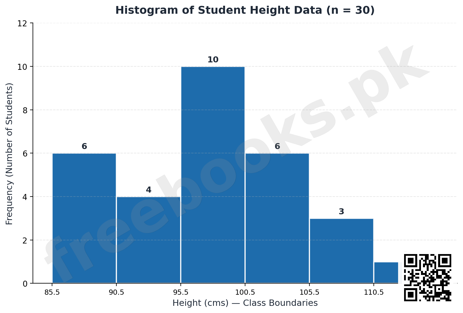
A histogram gives a visual impression of the distribution of grouped data by drawing rectangles: class boundaries are marked along the x-axis and frequencies along the y-axis. For equal class widths, the height of each rectangle is simply proportional to (equal to) its class frequency. For unequal class widths, the area of each rectangle — not its height — must be proportional to frequency, so the height is instead obtained as an adjusted frequency: class frequency divided by class width. The area under a full histogram equals the sum of the areas of all its rectangles (width x frequency for each class), which for equal-width classes equals class width multiplied by the total frequency. A histogram may also be constructed for discrete grouped data, by centering a rectangle on each possible value with equal width to either side (commonly 0.5). The main advantages of a histogram over unprocessed data are that it reveals the range, location, and skewness of the data, and can flag out-of-control or unusual observations.
2.6.6 Frequency Polygon and Cumulative Frequency Polygon
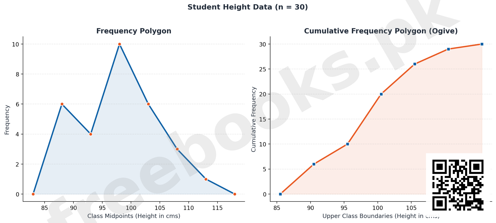
A frequency polygon is a closed geometric figure displaying a frequency distribution: mid-values of the class boundaries are marked on the x-axis, frequencies on the y-axis, the corresponding points are joined, and the resulting line is extended to meet the x-axis at both ends. It can equivalently be built by joining the upper midpoints of a histogram's rectangles and extending both ends to the axis. A smoothed frequency polygon is called a frequency curve, useful for visually assessing symmetry or skewness.
A cumulative frequency polygon (also called an ogive) plots upper class boundaries against cumulative frequencies (or cumulative relative/percentage frequencies): it is an increasing curve that starts at zero height at the lower boundary of the first class and rises to the total frequency at the upper boundary of the last class. It can be used to read off values corresponding to particular cumulative proportions, such as quartiles or percentiles. For discrete data, the cumulative frequency polygon instead makes a vertical jump at each data value (equal to that value's frequency) and stays flat between data values, since there is nothing to accumulate in between.
2.6.7 Scatter Plots
When two variables are measured on each individual — for example, height and weight — the resulting n pairs of observations (xi, yi) form a bivariate data set. A scatter plot displays this by placing one variable on the x-axis and the other on the y-axis, marking each pair as a point (a cross or dot). Bivariate data of this kind broadly falls into two types: paired measurements on the same variable (such as morning versus evening milk yield from the same cows, where the line of equality at 45 degrees is a useful visual reference), and two related but different measurements (such as soil nitrogen versus crop yield, where the interest is simply whether the two are related, since it makes no sense to directly compare values of different variables to each other).
2.7 Bivariate Frequency Distribution
When two variables are considered together, the resulting table is called a bivariate frequency distribution. It is constructed the same way as an ordinary frequency distribution, except that each pair of observations (xi, yi) is allocated to a cell formed by the intersection of a class of the first variable and a class of the second variable — for example, allocating a (height, weight) pair to the cell corresponding to its height class and its weight class simultaneously.
Important Definitions
What is classification in statistics?
The process of arranging observations into different classes or categories according to some common characteristic.
What is tabulation?
The process of making tables, or arranging data into rows and columns; may be simple, double, triple, or complex.
What is a frequency distribution?
A compact table that displays categories (classes) of observations along with the number of observations (frequency) falling in each category.
What is relative frequency?
The frequency of a class divided by the total frequency; the sum of all relative frequencies in a distribution should equal 1, except for rounding.
What is cumulative frequency?
The running total obtained by adding the frequencies of all preceding classes, including the class itself; it shows how many values are less than or equal to that class's upper limit.
What is an open-end class?
A class in a frequency table where either the lower limit of the first class or the upper limit of the last class is not a fixed number, such as 'Below 5' or '75 and above'.
What is a histogram?
A graph of a grouped frequency distribution using adjoining rectangles over class boundaries, where rectangle height (equal widths) or area (unequal widths) is proportional to frequency.
What is a scatter plot used for?
To visually display and study the relationship between two variables measured on the same individuals, by plotting each pair of values as a point.
Key Facts and Relations
| Topic | Key Fact / Relation |
|---|---|
| Range | Range = Maximum value – Minimum value |
| Number of classes (c) | c = 1 + 3.3 log(n), or c = sqrt(n) approximately |
| Class width (h) | h = Range / number of classes (approximately) |
| Relative frequency | r.f = frequency of class / total frequency |
| Cumulative relative frequency | c.r.f = cumulative frequency / total frequency |
| Percentage cumulative frequency | Percentage c.f = c.r.f x 100 |
| Pie chart sector angle | Q = (Component Part / Total) x 360 degrees |
| Histogram rectangle height (unequal class width) | Adjusted frequency = class frequency / class width |
| Area of a histogram rectangle | Area = width of class x frequency of class |
Diagrams
Histogram of a Frequency Distribution: A histogram built from the worked student-height example, showing class boundaries on the x-axis and frequency as bar height on the y-axis, for equal-width classes
Pie Diagram of Component Parts: A pie chart dividing a circular region into sectors by component share, illustrating the sector-angle formula Q = (part/total) x 360 degrees
Frequency Polygon vs. Cumulative Frequency Polygon (Ogive): Two related line graphs from the same grouped data: a frequency polygon joining class midpoints against frequency, and a cumulative frequency polygon (ogive) showing running totals rising to the total frequency
Short Questions & Answers
What is the difference between one-way and two-way classification?
One-way classification arranges data by a single characteristic at a time, while two-way classification arranges data by two characteristics simultaneously.
Name the main parts of a well-constructed table.
Title, column captions (box-head), row captions (stub), body of the table, source note, and prefatory notes/footnotes.
How is the number of classes for a frequency distribution decided?
Using the formula c = 1 + 3.3 log(n), or approximately c = square root of n, where n is the number of observations.
What is the difference between class limits and class boundaries?
Class limits are the stated end points of a class; class boundaries are obtained by extending the limits one more decimal place so classes become continuous and mutually exclusive, with no observation falling exactly on a boundary.
How does a multiple bar diagram differ from a simple bar diagram?
A simple bar diagram shows one bar per category; a multiple bar diagram groups several related bars (e.g., different years or groups) together at each category for comparison.
What is the formula for the angle of a sector in a pie diagram?
Q = (Component Part / Total) x 360 degrees.
How is the height of a histogram rectangle found when class widths are unequal?
By dividing the class frequency by the class width, giving an adjusted frequency, since the rectangle's area (not height) must be proportional to frequency.
What does a cumulative frequency polygon (ogive) show?
It shows the running (cumulative) frequency up to the upper boundary of each class, rising from zero at the start of the first class to the total frequency at the end of the last class.
Long Questions & Answers
Explain, with the steps involved, how a frequency distribution is constructed for continuous data.
What are the first three steps in building a frequency distribution for continuous data?
The first step is calculating the range, simply the maximum value minus the minimum value, which shows the total spread the classes must cover. The second step is deciding the number of classes, c, using the guideline c = 1 + 3.3 log(n), where n is the number of observations, or roughly c = the square root of n; too few wide classes lose real variation, while too many narrow classes scatter the data too thinly. The third step is deciding the class width, h, calculated as the range divided by the number of classes and then rounded to a convenient number.
How is the starting point of the first class chosen, and what is the difference between class limits and class boundaries?
The fourth step is deciding where the first class starts; this is somewhat arbitrary but usually begins just below the minimum value, so that the midpoint of the first class falls at a sensible, representative value. Class limits are the stated end points of each class as originally chosen. Because no observation should fall exactly on a boundary, limits are converted into class boundaries by extending each end point by one extra decimal place, so the upper boundary of one class equals the lower boundary of the next; an observation on a shared boundary is counted in the higher class.
How is the frequency distribution table actually completed once the classes are set?
The fifth and final step is to go through the data observation by observation, placing a tally mark against whichever class each value belongs to, continuing until every observation has been placed. The resulting tally counts, once totalled, are the frequencies of each class, and together they form the completed frequency distribution table. This step turns a defined set of class boundaries into an actual working table, showing how many observations genuinely fall into each interval of the data.
What further values can be derived once a frequency distribution table exists?
Once a base frequency distribution exists, several useful values can be derived directly from it. Class centres are the midpoints of each class, used to represent that whole class in later calculations. Relative frequencies are each class's frequency divided by the total frequency, useful for comparing distributions of different sample sizes. Cumulative frequencies are running totals of frequency up to and including a given class, showing how observations accumulate as classes progress through the data range.
Describe the different types of bar diagrams and the pie diagram, explaining when each is the appropriate choice.
What is a simple bar diagram?
A simple bar diagram is the most basic bar chart: the categories or values of a discrete or categorical variable are placed along the x-axis, and for each one a single bar is drawn whose height equals its frequency. Because the underlying variable is discrete or categorical rather than continuous, gaps are deliberately left between the bars, visually emphasizing that the values are separate and distinct rather than part of a continuous scale. This gap is the key visual difference between a bar diagram and a histogram.
What is a multiple bar diagram, and when should it be used?
A multiple bar diagram extends the simple bar diagram and is used when two or more related sets of data need to be compared side by side for each category. Rather than one bar per category, a small group of bars is drawn together at each category position, with one bar per data set. For example, when comparing wheat production across three localities over three years, three bars (one per locality) are grouped together for each year, letting the reader compare localities within each year and across years at a glance.
What is a sub-divided (component) bar diagram?
A sub-divided, or component, bar diagram is used when a simple bar already represents an overall total that can meaningfully be broken into component parts within the same bar. For instance, if a simple bar shows the total number of people in a blood-group category, that same bar can be sub-divided into a male portion and a female portion stacked within it. This lets a single bar simultaneously show both the total for that category and how that total splits internally between its parts.
What is a pie diagram, and when is it the appropriate choice?
A pie diagram divides an entire circular region into sectors, where each sector's size represents that component's share of the whole. The angle of each sector, out of 360 degrees, is calculated as Q = (component part / total) x 360 degrees, and the circle is shaded accordingly to keep sectors visually distinct. A pie diagram is the natural choice when the purpose is to show how a single whole divides into its component parts, and for comparing how that division changes across times or groups, though it grows cluttered with too many components.
Explain the different graphical tools used to display a frequency distribution — histogram, frequency polygon, and cumulative frequency polygon (ogive) — and describe how each is constructed.
How is a histogram constructed, and what changes when classes have unequal widths?
A histogram is constructed by marking class boundaries along the x-axis and frequencies along the y-axis, then drawing a rectangle over each class. When classes have equal width, the height of each rectangle is made proportional to that class's frequency, so taller rectangles directly represent more observations. When classes have unequal widths, it is the area of each rectangle that must remain proportional to frequency; the height is instead an adjusted frequency, found by dividing each class's frequency by its width, since a wider class would otherwise misleadingly appear taller than its true frequency warrants.
How is a frequency polygon constructed, and what is a frequency curve?
A frequency polygon is built by marking the midpoint of each class along the x-axis and its frequency along the y-axis, then joining these plotted points with straight lines, extended down to meet the x-axis at both ends to form a closed figure. It can equally be constructed by joining the upper midpoints of the rectangles of an already-drawn histogram. When this polygon is smoothed into a continuous curve rather than straight segments, it is called a frequency curve, which is particularly useful for quickly judging whether a distribution is symmetric or skewed.
How is an ogive constructed, and what is it used for?
The cumulative frequency polygon, or ogive, plots upper class boundaries along the x-axis against their corresponding cumulative frequencies (or cumulative relative or percentage frequencies) along the y-axis. Because cumulative frequency can only increase or stay the same, the ogive is always an increasing curve, starting at zero at the lower boundary of the first class and rising to the total frequency at the upper boundary of the last class. It is particularly useful for reading off values corresponding to a chosen cumulative proportion, making it convenient for estimating quartiles or percentiles directly from the graph.
How does the cumulative frequency polygon differ when the data is discrete?
For discrete data, the cumulative frequency polygon is represented differently from the smooth curve used for continuous data. Rather than rising smoothly, it makes a distinct vertical jump at each individual data value, with the height of each jump equal to that value's own frequency. Between consecutive data values, the line stays perfectly flat and horizontal, since there is nothing further to accumulate until the next actual data point is reached. This step-like shape reflects the fact that discrete data can only take isolated values.
Multiple Choice Questions (MCQs)
The process of arranging data into rows and columns is called: (A) Classification (B) Tabulation (C) Correlation (D) Regression
Correct answer: (B) Tabulation. Tabulation is the process of making tables, or arranging data into rows and columns.
The heading for different columns in a table is called: (A) Stub (B) Box-head/column captions (C) Source note (D) Footnote
Correct answer: (B) Box-head/column captions. The headings for different columns are called column captions, and this part of the table is called the box-head.
The formula for approximate number of classes in a frequency distribution is: (A) c = Range / h (B) c = 1 + 3.3 log(n) (C) c = n / 2 (D) c = h x Range
Correct answer: (B) c = 1 + 3.3 log(n). The number of classes c is approximated by c = 1 + 3.3 log(n), or c = sqrt(n).
Class width h is calculated as: (A) h = Range x number of classes (B) h = Range / number of classes (C) h = number of classes / Range (D) h = Range + number of classes
Correct answer: (B) h = Range / number of classes. Class width h = Range divided by the number of classes (approximately).
Cumulative frequency of a class shows: (A) The frequency of only that class (B) The number of values less than or equal to the upper limit of that class (C) The relative frequency of that class only (D) The class width
Correct answer: (B) The number of values less than or equal to the upper limit of that class. Cumulative frequency indicates the total number of values less than or equal to the upper limit of that class.
In a pie diagram, the angle for a sector is found using: (A) (Part / Total) x 100 (B) (Part / Total) x 360 (C) Part x Total (D) (Total / Part) x 360
Correct answer: (B) (Part / Total) x 360. The sector angle Q = (Component Part / Total) x 360 degrees.
For a histogram with unequal class widths, the height of each rectangle equals: (A) The class frequency (B) The class frequency divided by class width (C) The class width divided by frequency (D) The cumulative frequency
Correct answer: (B) The class frequency divided by class width. For unequal class widths, height = class frequency / class width (the adjusted frequency), so area stays proportional to frequency.
A cumulative frequency polygon is also known as: (A) A histogram (B) An ogive (C) A scatter plot (D) A pie chart
Correct answer: (B) An ogive. The cumulative frequency polygon is also called an ogive.
A scatter plot is used to display: (A) A single variable's frequency distribution (B) The relationship between two variables measured on the same individuals (C) Cumulative frequencies only (D) Sector angles
Correct answer: (B) The relationship between two variables measured on the same individuals. A scatter plot displays bivariate data — pairs of values (xi, yi) for two variables measured together.
A frequency table where the last class is written as '75 and above' is an example of: (A) A bivariate distribution (B) An open-end class (C) A cumulative distribution (D) A pie diagram
Correct answer: (B) An open-end class. An open-end class is one where the lower limit of the first class or the upper limit of the last class is not a fixed number, like '75 and above'.
Quick Revision Summary
- Classification = arranging data into classes/categories; Tabulation = arranging data into rows and columns
- Table parts: title, column captions (box-head), row captions (stub), body, source note, footnotes
- Frequency distribution steps: Range -> number of classes (c = 1+3.3log n) -> class width (h = Range/c) -> starting point -> tally
- Relative frequency = frequency / total; Cumulative frequency = running total of frequencies up to that class
- Simple bar diagram = one bar per category; Multiple bar = grouped bars for comparison; Sub-divided bar = one bar split into segments
- Pie chart sector angle: Q = (part/total) x 360 degrees
- Histogram: height = frequency (equal class widths) or frequency/width (unequal class widths)
- Frequency polygon joins class midpoints to frequency; Ogive (cumulative frequency polygon) is always increasing
- Scatter plot displays bivariate (paired) data as points; never join the dots
- Bivariate frequency distribution: each pair (xi, yi) allocated to the intersection of two variables' classes
Exam Tips
- Remember the 5-step recipe for building a frequency distribution: Range -> classes -> width -> start point -> tally
- Class limits vs. boundaries: boundaries always have one extra decimal place and never coincide with an actual observation
- For histograms: equal class widths -> height = frequency; unequal class widths -> height = frequency/width
- Pie chart angle formula (part/total x 360) is a common numerical question — practice with different totals
- Ogive = cumulative frequency polygon = always rises, never falls
- In scatter plots, never connect the dots with lines — that's a common mistake examiners look for